Overview
What it is
The Overview page is the analytics dashboard for your pipeline outcomes.
It visualizes:
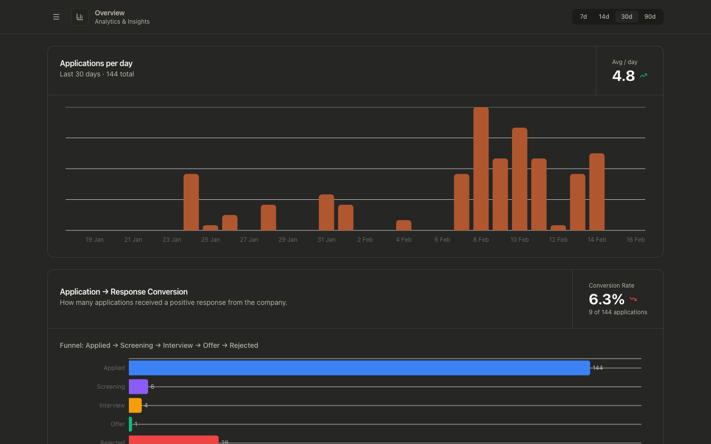
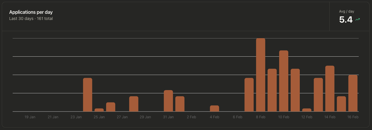
- Applications per day
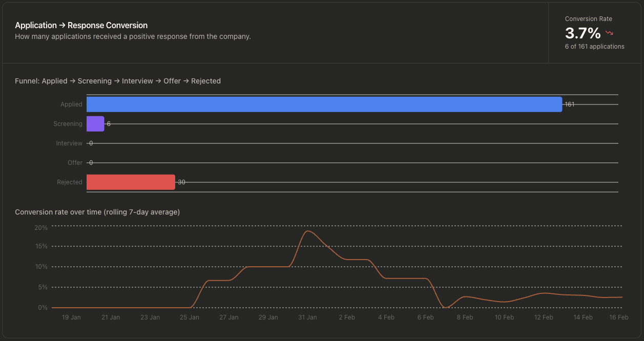
- Application-to-response conversion
- Funnel progression (Applied, Screening, Interview, Offer, Rejected)
- Response rate by source
Graph-level views
Why it exists
The page helps you measure whether your current sourcing and tailoring approach is producing responses, not just applications.
Use it to quickly answer:
- Are application volumes increasing or dropping?
- Is response conversion improving?
- Where are applications stalling in the funnel?
- Which job boards are actually generating responses?
How to use it
- Open Overview.
- Select a time window (
7d,14d,30d,90d) in the top-right selector. - Review:
- Applications per day for volume trend
- Application → Response Conversion for quality/outcome trend
- Response Rate by Source to compare job board effectiveness
- Compare periods and adjust your sourcing terms, filters, or tailoring strategy.
Data and calculation defaults
- Default window is
30d. - Only jobs in statuses
appliedandin_progressare used as input. - Conversion counts any positive response-stage event (for example recruiter screen, assessment, interview stages, or offer).
- Conversion trend chart uses a rolling window up to 7 days.
- Response rate by source is calculated across all time (not scoped to the duration selector), since response events may arrive well after the application window.
- Sources with fewer than 5 applications are hidden by default in the Response Rate by Source chart. Check Include small samples to show them.
Response Rate by Source
The Response Rate by Source chart shows, for each job board (LinkedIn, Indeed, Gradcracker, etc.), what percentage of your applications received a non-rejection response.
What counts as a response: the application reached at least one of these stages — recruiter screen, assessment, hiring manager screen, technical interview, onsite, or offer. Ghosted applications (no stage events) and rejected outcomes are both excluded from the numerator.
Each bar is labelled X% (n=Y) where n is the number of applications from that source, so you can immediately tell whether a high rate comes from a meaningful sample or a single lucky application. The full breakdown (response rate, responded, applied) is also shown in the tooltip.
Sources are sorted by response rate descending. Sources with fewer than 5 applications are hidden by default to avoid misleading percentages from tiny samples. Check Include small samples to show them.
Use this chart to identify which sources produce genuine engagement versus silence, and concentrate future sourcing effort accordingly.
Common problems
Empty charts
- Verify you have jobs with
appliedAttimestamps. - The selected duration may exclude your recent activity.
Conversion appears low
- Conversion only counts jobs that reached response stages.
- If stage events are missing or delayed, conversion will under-report.
Trend icons look counterintuitive
- Volume trend compares first-half vs second-half averages in the selected window.
- Changing the time window can materially change trend direction.
Response Rate by Source shows only one source
- Only sources with at least one applied job appear in the chart.
- If all your applications come from a single board, only that board will be shown.
Response rate for a source looks too high or too low
- Check the
n=value in the bar label or tooltip. A small sample (e.g. n=2) will produce an unreliable rate. - Sources with fewer than 5 applications are hidden by default. If you see a suspiciously high rate, you may be looking at a small-sample source — check the n.